Announcing UnAnchor 2.0
by Jason -- December 13, 2010
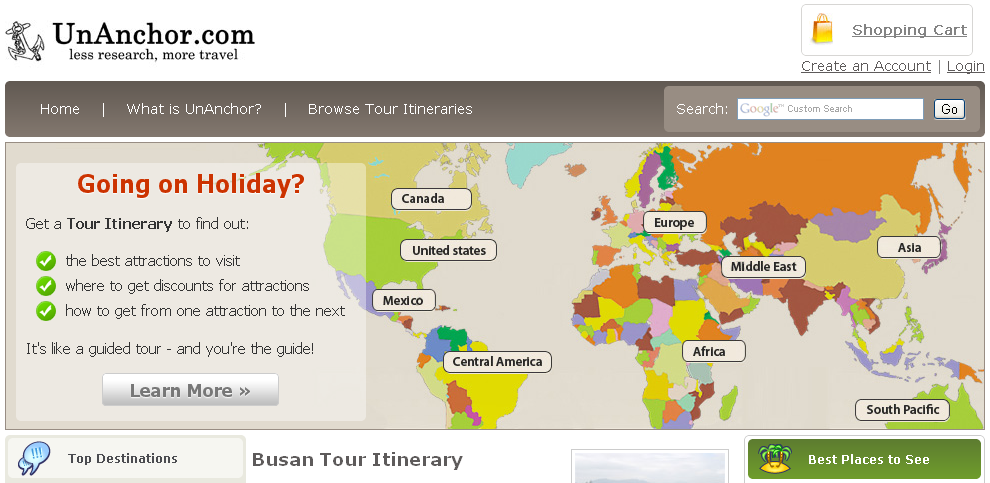
My co-founder, Mohammad, and I are very excited to announce that the next version of UnAnchor.com has officially launched. The new version has a brand-new design as well as a complete overhaul of the back-end code. In this post I’ll be discussing the details of the new version and what we’re working on next.
What is UnAnchor?
For those who are unfamiliar, UnAnchor is my travel start-up that launched this past May. UnAnchor is a marketplace of self-guided tour itineraries. Itineraries prioritize what to do and how to get around in your next travel destination so you can stop researching and start traveling.
UnAnchor 2.0
This initial launch is primarily cosmetic. However, the site has been completely rebuilt and it will now be far easier to add new features and scale up the site.
For the technical audience, the site no longer uses WordPress and has been rebuilt using PHP and the Symfony PHP framework.
What’s Next?
Now that we’ve officially launched the next version, we’re going to continue to build out features with the next version adding:
- Review System for the itineraries
- Public Profiles for the itinerary writers
The two main focuses from the business side are:
- Continuing to find itinerary writers
- Forming a team of advisors to help guide the direction of the site
As always, thanks for your support! Be sure to check out the new version. I’d also love to hear your feedback:
- What are your thoughts on the new design and the upcoming features?
- Do you have recommendations on finding itinerary writers?
- Finally, do you know someone or have a recommendation on someone who may be a good advisor? We’re looking for smart people interested in helping a young startup. Ideally, they would be in the travel industry or have connections within the travel industry.
Shoot me an email (Jason.Demant [at] gmail [dot] com) or leave a comment below, I’d love to hear your thoughts.
Be awesome and help us share:


Hey Jason, the site looks great. You might want to think about syncing up with Couchsurfer.org. You might be able to find some good writers there.
Hey there,
The new website looks good - with a couple things I’d fix. First, the map on top is nice - but you NEED some clickable space. I naturally gravitate to clicking on one of the labels… which goes nowhere… That would be a perfect way to begin searching / browsing by continent.
Also, the lists of ‘Top Destinations’ and ‘Best Places to See’ could be complemented by a ‘Random Awesome Places’ - and they need to be clickable as well. I’m presuming these are to guides available through your site?
One final thought - you already know the power of social networking - it’s time to integrate that into the site. People traveling, people wanting to travel, people wanting to give a gift, etc.
I 100% agree with Chris above. I actually clicked through from my feedreader just to comment about that. I too tried clicking on “Asia”, “Africa”, etc. and thought that there might be something wrong in the coding since I couldn’t actually click it.
To expand on Chris’ comment on the Top Destinations side panel - I would agree - make those clickable! Again, it was another moment of “WTF?” thinking there was something wrong with either my computer or your coding : )
Also, I would love to be able to preview a section of the Itinerary so I know what I’m buying. For example, the ‘3 Days in Phnom Penh, Cambodia’ itenerary describes nothing about what I would be doing there. If I’m going to spend $1,000 on a plane ticket and I choose Phnom Penh as my destination I would perfer to know a little about the itenerary before I buy it other than, ‘a 3 day itenerary for those who have a limited amount of time in Cambodia…..”.
Also, some of the iteneraries do not have pictures which make the site seem less full and it makes the iteneraries less interesting.
Just some feedback on my first impressions of the new site design. I love, love the new site compared to the last one and I think the advice Chris gives above is spot on. No site can be 100% perfect or please 100% of the people but increasing user design by following Chris’ advice would, I think, greatly improve your conversion rate.
Keep up the great work on the site - it looks fantastic!
@Erik — Thanks for the couchsurfing recommendation. That’s a good idea.
@ Chris — Thanks for the feedback! Definitely need to make the map clickable and integrate social media in the site. These are both things we’ll be working on adding in the next month or so. Good idea on the random awesome places idea as well, seems like a good way to highlight the not major city itineraries.
@Richard — Again, really appreciate all of the great feedback! Agreed that we need to make a few of those areas clickable. Some of it is a lack of content at this point, but hopefully we’ll be working on that as well. You make a good point about the preview idea, we’ve struggled with exactly how to do this, but we need to figure something out. And more pictures for the itineraries are coming soon! Thanks again!